As a Linkedin power user, have you ever realized what happens to your image dimension when you upload via Linkedin status update? It doesn’t fit well with its image placeholder, does it?
LinkedIn Corporation (NYSE: LNKD), the world’s largest professional network on the Internet, with more than 300 million members, reported its quarterly results for the third quarter of 2014. – Source
I always post professional visual quotes on Linkedin such as entrepreneurship, design thinking, user experience, infographic, design education, personal growth, etc.
But, these images never go well with Linkedin’s post format template; very bad user experience as compare to other social networks.
I didn’t find a proper solution whether one can go for a square format, 4:3 aspect ratio, etc. All you can find Linkedin’s banner image dimension, size of the logo, cover photo, etc., but not its status post format.
Thus, so I came up with this solution as how one can find the exact dimension while uploading a photo media via Linkedin status update.
Linkedin initiated this feature called add rich media to your profile?in 2013 in which you can share an idea by uploading an image, a presentation, or a document file.
But the problem is Linkedin never shared the usage guide under its help pages. For instance, you will find this common answers under Linkedin help page when you search “How do I share an idea, question, article, or website with others?.”
There are two things why Linkedin is spoiling its home feed that looks half-cooked. So what are the points?
Linkedin doesn’t prompt you to improve the image size/quality while uploading a smaller image having 20px by 20px. It only prompts how to improve your profile; it lead to its business model.
User Interface plays an unique role in this scenario, but why? Because your framework should accept & display any media file type.
Problem with linkedin status update
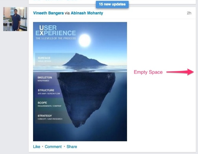
Let’s look at the following screenshot from Linkedin home feed.

Can you see the empty space next to the image! Why is it happening? Do you think the solution is the upload a high resolution photo like you upload on Facebook? No, it won’t work. It won’t even work the way you upload a tallest infographic image on Pinterest/Google+. So what’s going wrong over here on Linkedin platform?
Solution?via Chrome Developer Tools
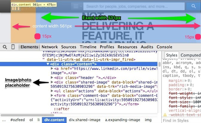
After spending a couple of minutes using chrome’s developer tools, I came to know that it’s happening because of following CSS classes:
.feed-update .shared-image margin: 10px 15px;max-height: 400px;
What’s fixed here is the max-hight?css declaration. What does that say? Linkedin will shrink down your image/photo having larger height into its largest height; 400px. This is the exact height of your image, note it down.
So what about the width of the image?
There is a common content class that holds all information about a Linkedin post update. The size of the content class is 561px into 475px as you can see bellow.

As I mentioned before, both the feed-update?and shared-image?css classes having “10px 15px margin” via css declaration. What does that?mean?
That means 10px for top margin, 10px for bottom, 15px for right margin, and 15px for the left.
To get the exact width of the image container you need to remove 30px margin (15px for left & 15px for the right).?Subtract this 30px of margins from the container class; 561px – 30px = 531px. This is the exact width of your image.
Note: The exact size of your image/photo is 531px into 400px. Now you know the reason why it was leaving a lot of white space.
This post is not about just getting the exact dimension. The process will help you to find and calculate exact dimensions next time onwards, especially if Linkedin will come up with its new page design.
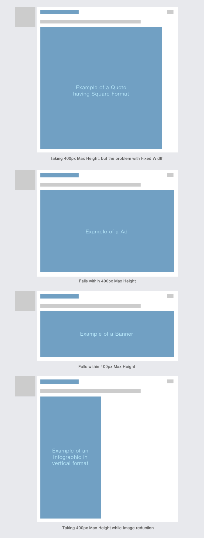
Let’s look at some of the examples bellow as what happens when you upload images having different dimensions as compare to an image having 531px into 400px height.

Note: The ratio of a?”531px into 400px” image is 1.33:1 via Pixels and Aspect Ratio Calculator.
Try to upload an image having 531px into 400px (1.33:1 ratio), and do let me know your experience by adding some comments bellow.
Leave a Reply